The Experience Equation:
Crafting a World-Class Tech Event
Event
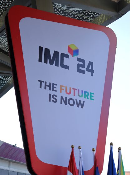
India Mobile Congress
Scope
Identity, Visual System, On-site Experience
Year
2024
Brief
How do you design a world class technology event, hosting a global audience from 120 countries, while keeping its India roots center-stage ?
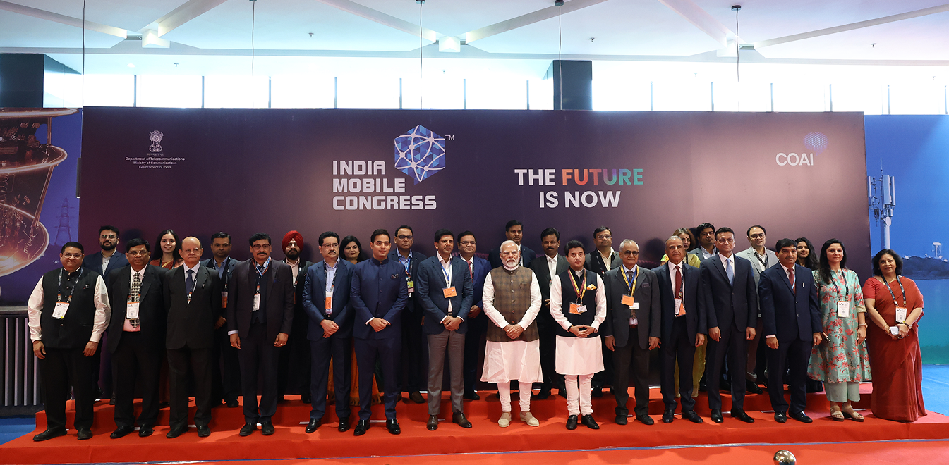
It was a pleasantly mild winter month of October last year. New Delhi was hosting IMC (India Mobile Congress) 2024 in Bharat Mandapam, one of the largest convention centres of India. It brought together global leaders, innovators, and industry experts to collaborate on next-generation technologies. The event focused on key areas such as 6G and 5G advancements, artificial intelligence, quantum technology, cybersecurity, semiconductors, cloud computing, Internet of Things (IoT) and electronics manufacturing.
IMC is Asia’s largest tech fest, organised annually. The 8th edition was a 4 days event from 15 to 18 Oct, 2024. About 2 lakh visitors experienced the latest in tech showcased by more than 400 exhibitors and 900 startups coming from over 120 countries.
Brand Strategy
2024 Edition – a turning point for the event
He kept designing stalls for his employer every year after that, including in 2024. In parallel, he was also having discussions with IMC CEO Ramkrishna (fondly called Ramki ) and team, brainstorming on ideas to make the event bigger and bolder every year. They were interested in collaborating with us and saw us as a partner who
- wanted IMC to succeed and
- can come up with a new, fresh way of thinking about design that is not a copy of an American or Indian design
- has the persistence to get those designs executed
In August 2024, we were asked to take charge directly and develop the complete design and experiences.
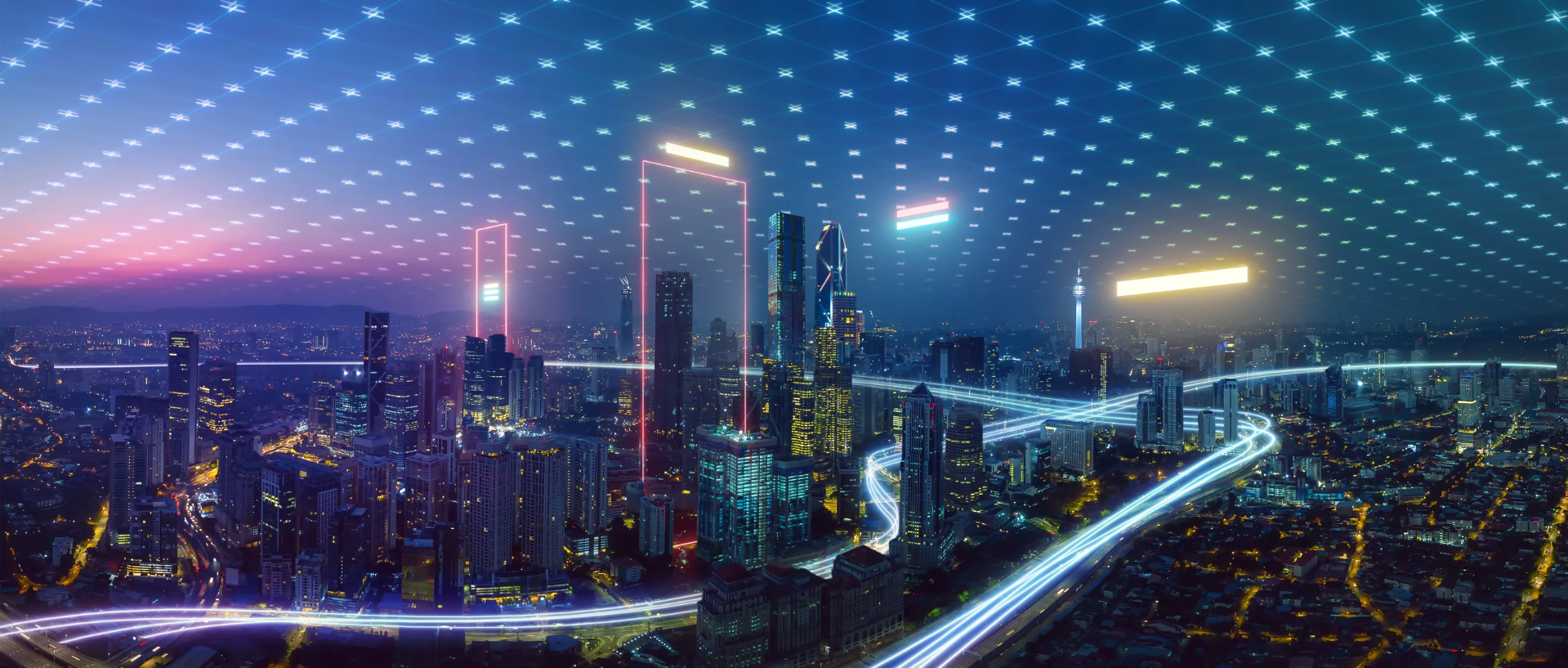
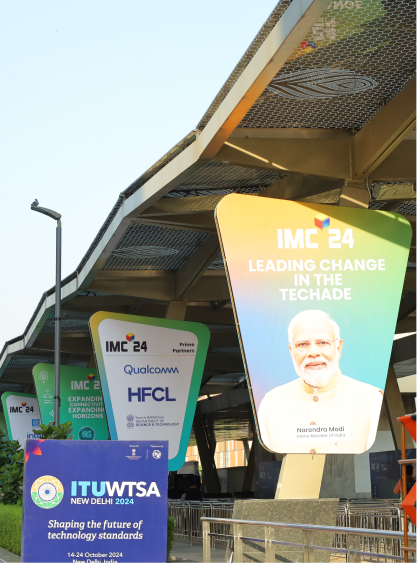
Vibrant Colour Palette representing Utopian Vision
2024 Edition – a turning point for the event
The design process begins with a careful selection of the colour palette.
The theme for IMC 2024 was Future is Now. It had to be about the future more than the past.
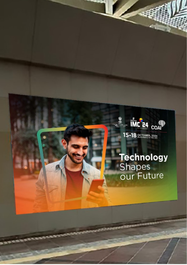
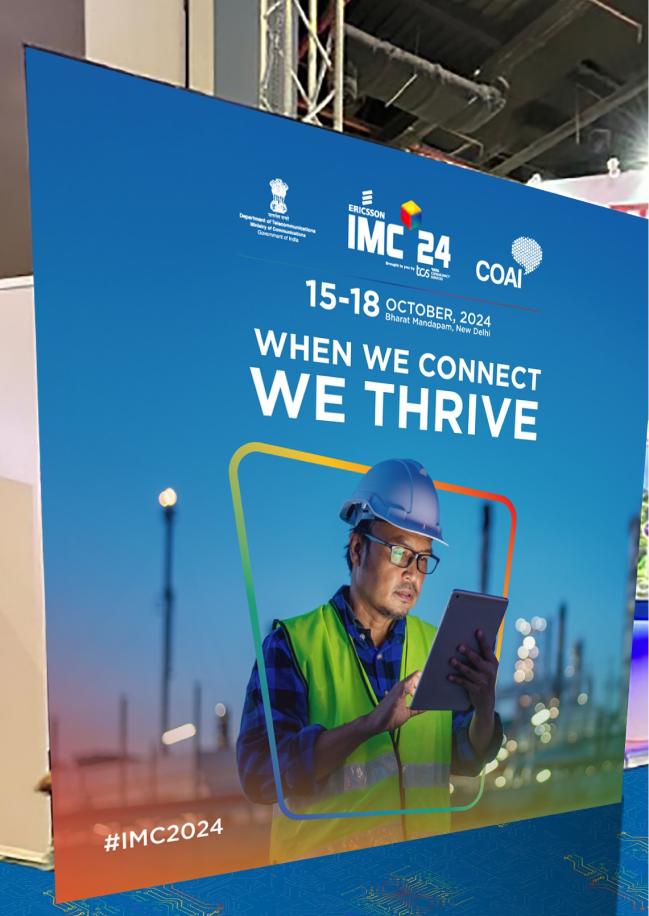
We chose vibrant colours representing utopian future rather than steel colours that have dystopian undertones. To give it a modern contemporary look, we chose flowing gradients instead of spot colours.
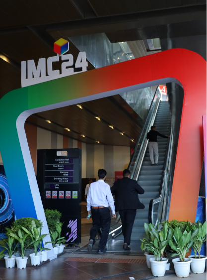
Transformed Logo with Depth and Meaning
The logo had to be unique and yet not disconnected from the past logos.
The previous logo had a lot of details and needed the viewer to focus a lot of attention to grasp it. We needed something instantly eye-catching in the attention-deficit age that we are living in.
So we took the hard-edged monochrome hexagon of the old logo and transformed it into a floating cube with soft edges and multiple colors. The 3 dimensional cube had depth vis-à-vis the 2D hexagon.
We gave it soft corners that represented flexibility and fungibility instead of rigidity. It also gelled well with the roundedness of Poppins font in the name. Multiple colors signified the openness to a wide spectrum of possibilities.
Imagery Eliciting Positive Emotions
The imagery you choose depends upon the emotions you want them to generate in your viewers. In our case, they were wonder, joy and unconstrained possibilities.
No borders were to be used in the designs to bring out the unconstrained possibilities aspect. We also designed our creatives with the images going beyond the frames for this.
We began looking for pictures of people with smiling faces that conveyed joy at work and wonder inspired by the tech around. Online repositories of stock photos were the best places to find them.
To our disappointment though, we soon discovered a sheer lack of Indian faces in such photos. Indian faces were absolutely necessary because that is how we make the imagery relatable to the India in India Mobile Congress.
We chose to go for compositing images – picking up the backdrops and the models separately and stitching them together carefully.
Unique and Easily Replicable Shape
The imagery you choose depends upon the emotions you want them to generate in your viewers. In our case, they were wonder, joy and unconstrained possibilities.
Our design philosophy was guided by the aim of making IMC uniquely recognisable. We wanted that when people looked at them, they should immediately say “Oh I know this is IMC.” Also, it had to be unique in the sense that its IMC 2024.
When we looked at the existing design trends, we found common shapes, like squares and rectangles inside squares and rectangles, circles, ellipses, triangles, etc. Our aim was to have a unique shape which is also simple enough to be easily replicated.
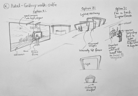
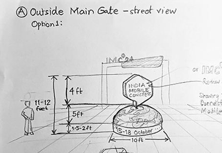
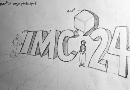
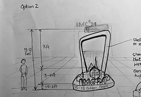
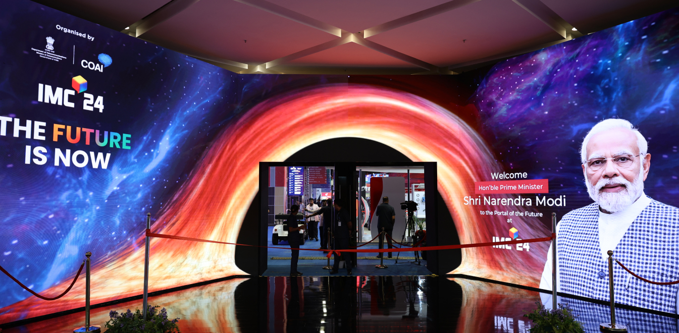
We chose a shape that wasn’t used anywhere else and denoted a movement from one place to another. We chose the portal, in the form of an oblique quadrilateral with rounded corners.
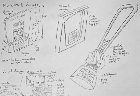
This shape was then used everywhere in all the designs we made for the event, from the entrance gates to the stages and from the print and digital collateral to the trophies.
Visual Identity
We also came up with a lot of other design options for walkthroughs, selfie spots, trophies, stages (thematic designs like the globe is ours, tree of knowledge them, celestial space design, palace themed design, etc.)

Visual Identity
We also came up with a lot of other design options for walkthroughs, selfie spots, trophies, stages (thematic designs like the globe is ours, tree of knowledge them, celestial space design, palace themed design, etc.)
Visual Identity
Another big success was the knowledge street.

The Blueprint for Brilliance: Our Approach in Action
We had some fantastic brainstorming sessions with designers and experts, generating some truly spectacular themes, ideas, and concepts! Our next step was to work with the implementers to bring these exciting visions to life.
We learned a lot about how to best collaborate and communicate during this process. Sometimes, it took a bit of gentle encouragement to explore new approaches and try things that seemed unconventional at first.
We discovered that everyone has a wealth of experience to share, and by working together, we could often achieve results that surprised even ourselves!
This experience also gave us valuable insights into the implementers’ technical expertise and capabilities. We gained a clearer understanding of the types of designs they could readily produce, and where we could offer additional support.
Another key takeaway was the importance of early and frequent communication. We found that providing feedback during the initial stages of the implementation process, rather than waiting for the final output, was incredibly helpful. This allowed us to address any potential issues early on, saving time, effort, and resources, and ultimately leading to much more successful outcomes.
Overall, it was a truly rewarding journey, full of excitement and valuable learning experiences.
It’s rare to find an agency that brings such an interesting, innovative idea to the table but then also knows how to design and engineer the product.
Full Name, Vice President